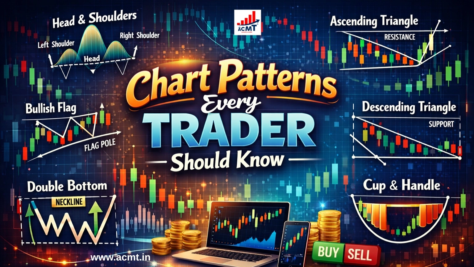
Chart Patterns Every Trader Should Know
Technical analysis is typically conducted using chart patterns. While this might be true, you need some knowledge of charts and their movement before you use them effectively.
When you notice a shape in the price chart, it indicates a pattern that suggests what you can do next or how prices could move based on their past movement. As a trader, when you study the chart pattern, you must know exactly what you are looking for.
Categories of Chart Patterns
There are broadly three patterns in charts:
- Continuous – Where a series of signals are emitted, depicting that a trend is bound to continue
- Reversal – This could indicate a change in direction in a particular ongoing trend
- Bilateral – A pattern that shows that the price could move either way, and the market is highly volatile
Take a particular position with CFDs with all of these patterns, which will let you go short or long and speculate on rising or falling markets. For instance, when you see a bearish continuation or reversal, you will want to go short. Alternatively, when you notice a bullish continuation or reversal, you may want to go long. The action you take depends on your analysis of patterns and markets.
Chart Patterns
Head and Shoulders
When you see smaller peaks on either side of a large peak, it is called the Head and Shoulders chart pattern. This is typical of a bullish-to-bearish reversal, and the first and third peaks are initially smaller but return to the same support level, or the neckline. You will notice a breakout into a bearish downtrend once the third peak falls back to the support level.
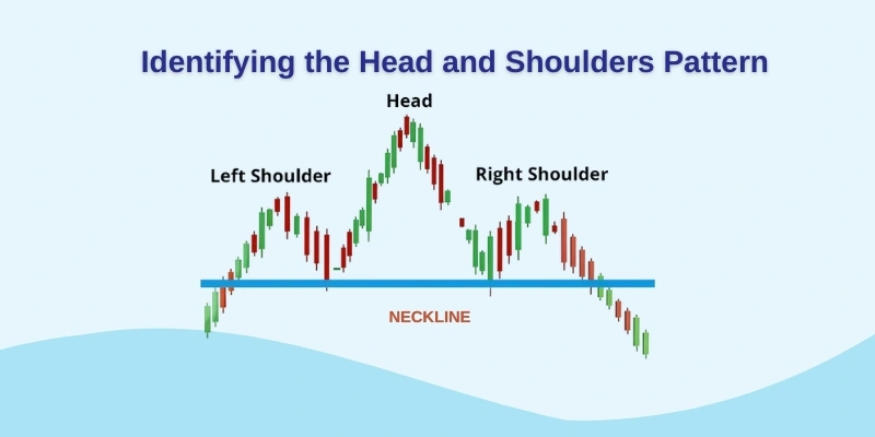
How does it work?
- Check the first and third peaks. These are smaller than the second.
- These fall back to the neckline.
- Once the third peak has fallen to the neckline, it breaks into a bearish downward trend.
Double Top and Double Bottom
When you need highlighted trend reversals, you use the double-top pattern, in which the asset’s price reaches a peak and then retraces to a specific support level. Thereafter, you could see a climb once again before it reverses permanently against the prevailing trend.
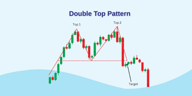
How does it work?
- Asset first experiences peak.
- Retraces back to the neckline.
- Climbs up again.
- Falls back to the prevailing trend.
Another pattern is the double bottom, which depicts the asset’s price dropping below support, then rising to a specific resistance level before dropping off once again. Finally, you will see a trend reversal and an upward movement as the market turns bullish. This is typically a reversal pattern because it marks the end of the downtrend and the start of the uptrend.
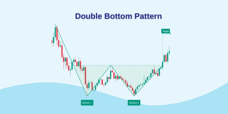
How does it work?
- The asset first drops below the level of support.
- Rises to the level of resistance.
- Drops again.
- Reverses to a bullish trend.
Rounding Bottom
The rounding bottom could signify a reversal or a continuation. During the uptrend, you will notice a marginal pullback in asset prices before they rise again, indicating a bullish continuation. However, if the asset price shows a downward trend and a rounding bottom before trend reversal, then it’s a bullish uptrend.
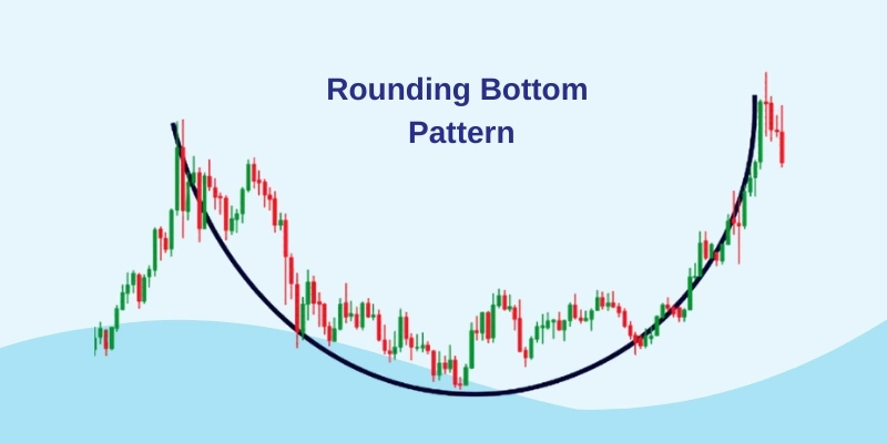
How does it work?
- Asset price is in a downward trend.
- Rounding bottom formed.
- Trend reverses.
- Enters bullish trend.
Cup and Handle
Used primarily to show bearish market sentiment, the cup-and-handle bullish continuation pattern flows until the overall trend resumes a bullish movement. You will see a familiar rounding bottom chart pattern, with a wedge pattern for the handle.
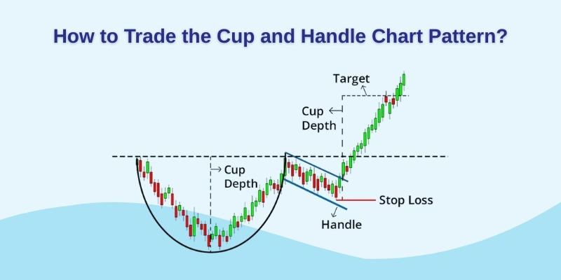
How does it work?
- Asset price enters temporary retracement – the handle.
- Rounding bottom formed.
- Asset reverses out of the handle
- Continues bullish trend.
Wedges
When price shifts constrict between two trend lines, you will see a wedge formation. They are of two types:
- Rising – The trend line is ideally between two upward, slanted support and resistance lines. With a steep resistance line, the pattern signals that the asset price will decline permanently and break through the support level.
- Falling – In this, wedges are seen between two downward-sloping lines, and the line of resistance is steeper than the support line. Typically, this indicates a later rise in the asset price, breaking through the resistance levels.
Pennant or flags
Flag or pennant patterns are seen when the asset price experiences a prolonged upward movement followed by consolidation. During the early stages of the trend, you will notice an upward movement, followed by smaller downward and upward movements.
How does it work?
- Asset experiences upward movement
- Then comes consolidation
- Enters into a small series of upward and downward movements
Triangles – Ascending, Descending, Symmetrical
There are three types of triangles:
- Ascending – Shows a bullish continuation pattern, which means the continuation of the uptrend. You can draw ascending triangles on a horizontal line along the resistance or swing highs and an ascending trendline along the support or swing lows.
- Descending – This signifies a bearish, continuous downtrend, and the trader can enter a short position in CFDs during this period to profit from the falling market.
- Symmetrical – It could signify the bullish or bearish trend, depending on the prevailing market. This is a continuous pattern that typically moves in the same direction once the overall pattern forms. When the price merges with a series of higher troughs and lower peaks, you will see a symmetrical pattern.
Bottomline
While there is no single chart pattern considered optimal, it is best to use a combination of charts that ideally suit your requirements and psyche. Different trends are used to highlight a variety of markets, and most often, candlestick trading is used, which makes it easier to visualise the market’s opens and closes. While some patterns are better suited to a bullish market, others are better suited to a bearish one. However, before you get into the nuances of chart patterns, you must learn all about support and resistance.
- Support – the level where your asset price bounces back up after a fall
- Resistance – the level where the price dips after a rise
Pro Tip: The balance between demand and supply, or buyers and sellers, is depicted in the form of support and resistance levels. When demand exceeds supply, there are more buyers in the market; when supply exceeds demand, there are more sellers. You must also know that prices tend to rise when there’s more demand and fall when there’s more supply.
When the asset price appears to be rising, demand is outstripping supply. However, a maximum price is achieved that the buyers are willing to pay, and at this time, demand decreases at that very price. Buyers here decide to close their positions, creating resistance. This causes the price to fall, and supply begins to outstrip demand.
Traders tend to buy back when the asset prices fall far enough.
Demand begins to rise in relation to supply if buying continues. This will also drive the price upward towards the level of resistance, and demand begins to increase.
Learn all about trading, technical analysis, and chart patterns at ACMT. You will also find a 100% free online course. Get our app to know more.
About the Author
Mr. Arun Gupta is a leading stock market trainer and trader who practices in Jaipur. For him, it’s not just about conventional trading. It is about applying proven methods alongside modern technology and prudence that makes a successful trader. He delves into the why, what, how, and when of stock trading using the best combination of historical analysis and practical investing. With decades of experience, expertise, and learning, Mr Gupta today guides millions through the complexities of the stock market.